How Wide Should Your Design Be?
One of the most fundamental differences between designing for the web and designing for print is that there is little predicability in how your web design will be viewed.
In print, you at least have control over what size paper your design is printed on. On the web, the same site may be viewed on a mobile phone, a netbook, an iPad, or a 30-inch monitor. That means you don’t have any idea how big things are going to be, or where the edges are.
There are many ways to approach this challenge, depending on the kind of content your site has, how much design effort you can invest, and what your priorities are. If you’re designing in Photoshop and someone else is going to be coding the site, then you don’t have to worry about the technical details. But it remains crucial for you to understand the issues and make the key decisions about how the site will behave in different contexts.
Fixed vs. Fluid
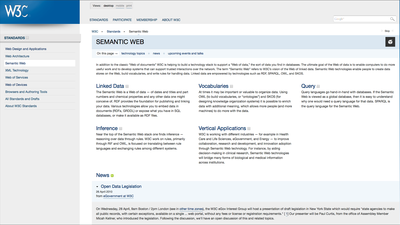
The most fundamental decision you need to make is whether your site has a fixed width or scales to fit the browser. For certain kinds of sites, especially those with a lot of content and not a lot of images and fussy layouts, a fluid design that fills the browser width may be best. But more often than not, the well-intentioned desire to make use of whatever screen real estate the viewer offers results in a less usable site. Ironically, the W3C’s own site, shown at the top of this post, provides a great illustration of this problem.
The primary issues with fluid designs are:
- Line lengths become too long for good readability.
- Gaps open up in the design.
- Visual proportions cannot be maintained.
- Relationships between elements can be lost.
These issues can all be overcome, to varying degrees, with enough effort. You can, for example, allow text regions to scale but set a maximum width. The question is, is it worth it? Usually, it is not.
A grid of thumbnails is the perfect application for a fluid layout.
Fluid designs make the most sense when there is a grid of items that can be easily extended to include more items and use all the available space. An excellent example of this is iStockphoto‘s image browsing pages. (Note that this site uses a fixed width for informational pages that do not have a grid of images.)
If you decide to use a fluid approach, and you’re creating a design in Photoshop that someone else will be coding, be sure to specify which elements should stretch as the width changes, and which should remain the same. It’s helpful to create a few different mock-ups at different widths, so you can see how things look.
Picking a Width
If you decide on fixed width, the next question is how wide it should be. There is a broad consensus today that the optimal width is 950 to 980 pixels. This fits on a 1024 × 768 monitor, with nearly any browser, providing room for the browser chrome, without horizontal scrolling.
Make sure your background image will fill the screen area.
If you are using a background image for the area outside of the fixed-width content area, then you also need to take into account what will happen on wide screens. Screens up to 1920 pixels wide are quite common now, so you may want to make your background image that width. Ideally, the background would be a narrower stripe that can be repeated horizontally to fill any width.
There’s one place where this width isn’t going to work well: on a mobile device. This is a complex subject for another day, but in essence, you need to decide how much effort you can afford to put into providing a great mobile experience.
The simplest solution is just to provide a mobile style sheet, which can set different widths and hide content you don’t want to display (see, for example, The 5-Minute CSS Mobile Makeover). But for a fully optimized mobile experience, you’ll want to think through the mobile experience from scratch, crafting a different set of pages optimized for the needs of mobile users and for the realities of a small screen.
What About Height?
Web pages typically have an arbitrary height, since vertical scrolling (unlike horizontal scrolling) has become something people are accustomed to. Even so, the content that fits in the top screenful (‘above the fold’) will be viewed by the most people, so it is worth keeping the most critical content up high (see Jacob Nielsen’s Scrolling and Attention). The height is even harder to gauge than the width however, because it is not only affected by screen size but is also strongly affected by what browser toolbars are installed; 600 to 800 pixels or so is a typical range.
The Dauenhauer site is designed with a print-like orientation, with both height and width fixed.
If your site doesn’t have a great deal of content, you can use a fixed height, though this sort of design is less frequently used today. It has the benefit of allowing you to control the graphical relationships between elements. If you have more text than will fit, though, you end up with internal scroll bars; by using JavaScript, you can improve the appearance and behavior.
Topics: Webvanta History