Virgin America: A Striking Example of Mobile First
One of the biggest influences on the recent evolution of the web is the "mobile first" approach to design.
Rather than starting with a desktop site and slimming it down to create a mobile version, the mobile-first approach begins with a mobile design, and then adds to that for the desktop version.
Virgin America’s Stunning Redesign
Virgin America has been testing a new site that takes this approach to its limit: the desktop and mobile experience is virtually the same, with vast amounts of white space on each page when viewed on a desktop.
This style of design reflects a radical departure in website strategy. Rather than seeking to make the most of the real estate available on a page, Virgin’s new design instead presents only the minimum required information, keeping the user focused on a small number of things they need to do to continue with the reservation process.
Here’s the old home page:
Depite a fairly sophisticated design, the word that immediately comes to mind is "clutter".
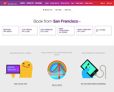
Here’s the new home page:
Wow! What an astonishing difference. Clean, simple, and focused on where I want to fly.
Note that it doesn’t ask where I’m flying from; it uses geo-location to find my nearest airport, and assumes that’s where I’m starting. And rather than asking me to choose from a long list of possible destinations, it prominently shows the most common destinations, so most users can get started with one click (or touch).
The new design does away with the slider, a feature that has become pervasive but has been shown not to be as effective as people hoped.
It also pares the "additional information" items from 10 to 3, reflecting a much tighter focus. (I’m not crazy about the treatment of the three items, but three seems like about the right number.)
Booking Wizard
What happens when you choose a destination? A simple wizard begins collecting the information needed to book the flight.
Note the landing-page-like focus, with virtually no navigation, no footer, and no sidebars.
Few Differences for Mobile
Because the pages are so sparse, they translate easily to a small screen.
Here’s what the home page looks like on a phone:
If you scroll down, there’s more information, but the heart of the page is the desitnation selection.
Once you choose a destination, the mobile experience continues to be just like the desktop experience:
With so little content on the page, all that’s needed to adapt it from desktop to mobile is a little rearrangement.
Mobile-First, Task-Focused
The Virgin America sits provides a stunning example of how different a web experience can be if approached from a fresh, mobile-first, task-focused perspective. Not all sites lend themeselves to such radical simplification, and few have a user base so likely to be mobile, but there are lessons here for everyone.
Topics: Mobile Web, Web Design