Make Your Site Mobile-Friendly to Preserve Your Search Rankings
If you have been putting off making your website mobile-friendly, now is the time to act.
Last week, Google changed its search algorithm to lower the rankings of sites that aren’t mobile friendly, when the search is performed on a phone. If your website is not mobile-friendly, your site will show up lower down in the search results for people searching Google on their mobile phone. (Note that searches performed on tablets and computers are not affected by this update.)
Worldwide, about one-third of web accesses now take place on a phone. The percentage is a bit lower in the U.S. (around 26%). Keep in mind, however, that these are averages — for many businesses, especially in food and entertainment, mobile traffic is already more than 50%.
Analyst reports estimate that, in the fourth quarter of 2014, about 17% of searches occurred on mobile phones. Those searches may be more important than those on the desktop, however, in that some studies suggest that mobile searches are more likely to result in a site visit.
Getting better placement in search results is just the latest reason to make your site mobile-friendly. Providing a good user experience for people visiting your site on a phone is the primary reason, and this motivation is getting stronger by the day. As more sites become mobile-friendly, people browsing on phones will become less and less tolerant of sites that are hard to use on their phone. If your site is one of those, you’re at risk of having visitors immediately leave your site, even if they do manage to find it.
For more details on Google’s changes, see Google’s blog post about the algorithm change, and its follow-up post announcing the change is in effect.
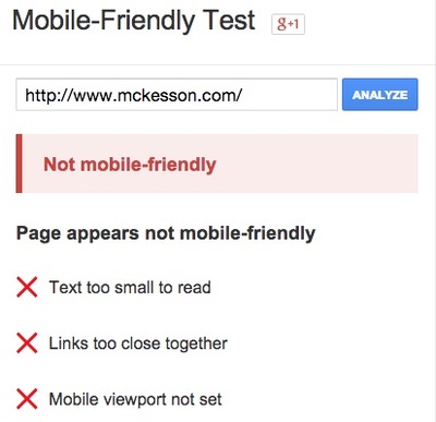
You can test to see if Google views your site as mobile-friendly by entering your URL in Google’s mobile-friendly testing tool.
In the past year, we’ve rebuilt more than a dozen sites to be mobile-friendly. Examples include:
- Iron Spring Farm
- i2i Systems
- Equipt Expedition Outfitters
- Cedarburg Chamber of Commerce
- Mill Valley Refuse
All of these sites use responsive design, in which a single set of HTML pages serves all devices. Special CSS instructions, called media queries, apply different styling for different screen widths.
We can help make your website mobile-friendly whether it is built on the Webvanta Cloud CMS or using WordPress. And if you are still living with a static site, we can convert it our Cloud CMS and make it mobile-friendly at the same time. Schedule a free consultation for an evaluation of what it will take to make your site mobile-friendly.
Topics: Mobile Web, SEO